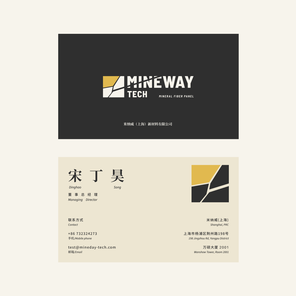
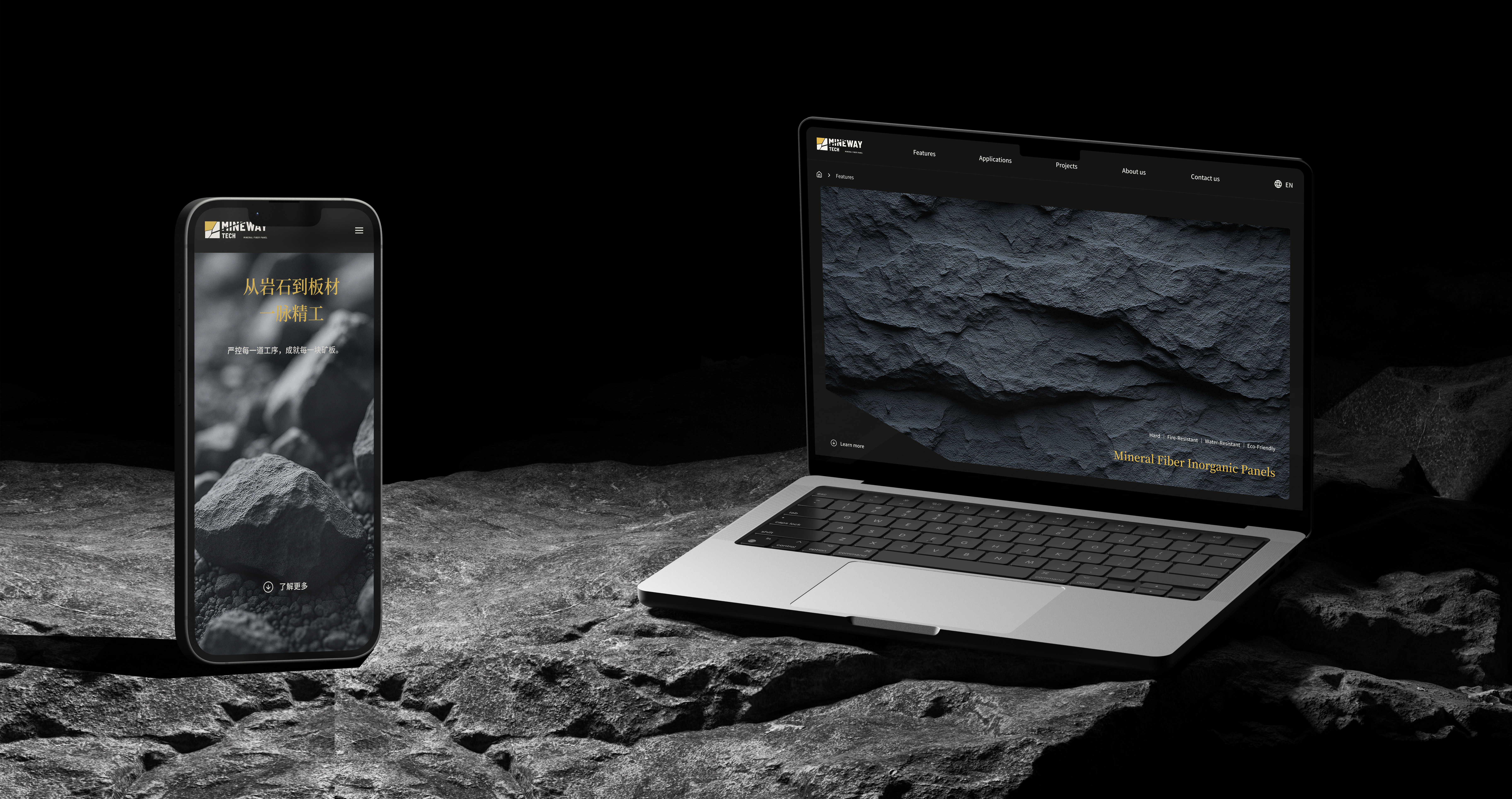
Brand identity and website for MineWay — a new-material company whose mineral-fiber board turns raw ore into architectural surfaces. A visual language built on three pillars: Natural · Solid · Minimal.
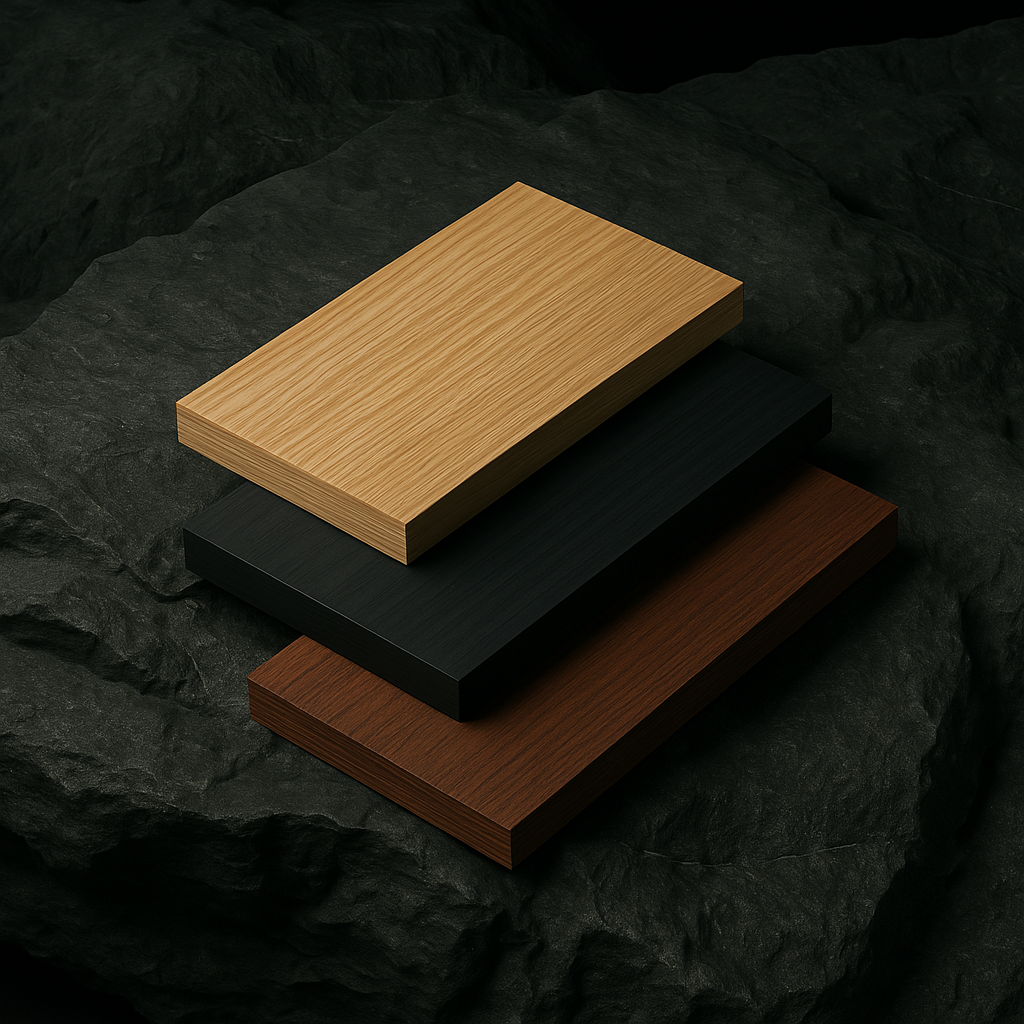
MineWay (米纳威) is a Shanghai-based new-material company producing 岩矿板 — a mineral-fiber inorganic density board that combines the hardness, fire-resistance, and water-resistance of stone with the workability of wood. Their product is born from a material evolution: black ore → molten magma → centrifugal fiber → high-pressure board. The brand had to honor that transformation — from raw to ordered, from chaos to composition.
Live website- ClientMineWay (米纳威) · MineWayTech A/S
- Year2025
- RoleBrand & Product Designer
- ProductBrand Identity + Website + Collateral
- DeliveriesBrand Strategy · Visual Identity · Logo Exploration · Color System · Website Design
- ToolsFigma · Illustrator · Chinese + English typography
- PaletteLight Ore Yellow · Reed White · Spruce Green · Baked Soil Brown · Stone Brown
From raw to ordered“From primal to structured; from chaos to composition.”
Brand philosophy
Material as language“Delete decoration. Leave breathing room. Reconstruct without redundancy.”
Design principle
MineWay's identity lets the material speak first. The visual system refuses decoration in favor of order, and the color palette — ochre, clay, olive, charcoal, iron — stays as close to the ore as the product itself. The result is a quiet, architect-facing brand with enough structural confidence to carry a material company into international markets.